Predefined dashboards
Uptrends includes a set of ready-to-use dashboards that give you instant visibility into your monitors' availability and performance with no setup required. Use them as your daily starting point for monitoring, incident triage, SLA reporting, and performance analysis.
You can access all predefined and custom dashboards by going to Dashboards.
Based on their purpose, predefined dashboards provide the following types of insights:
- Status — real-time view of your account, monitors, and alerts' current state.
- Availability and errors — real-time view of your uptime performance, SLA compliance, and error breakdowns over time.
- Analysis — detailed logs of monitor checks and alert history for incident investigation.
- Performance — response time metrics broken down by period, monitor, and checkpoint location.
- Monitor type-specific dashboards — focused views for specific monitor types such as uptime, browser, API, and transaction monitors.
Status
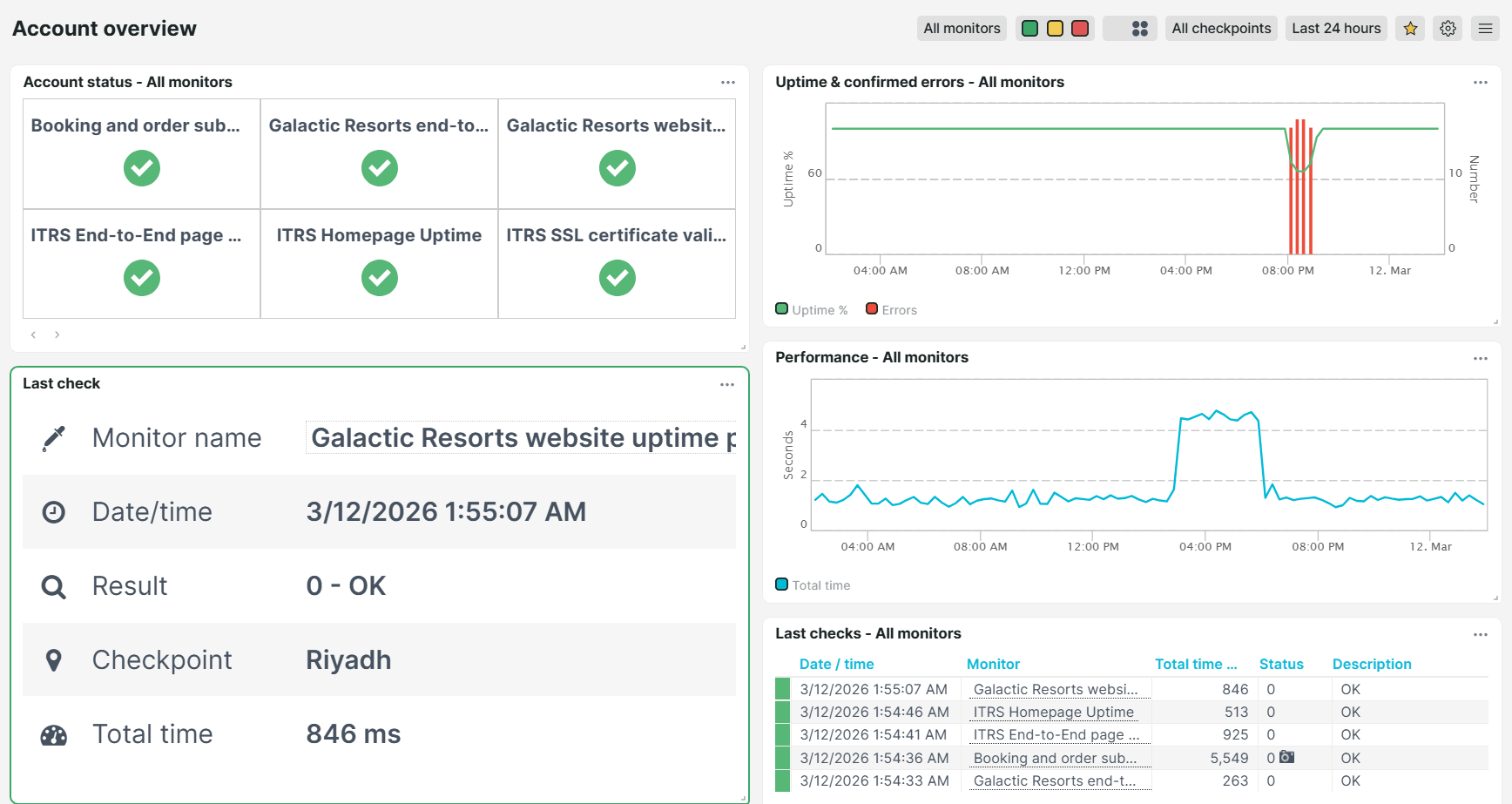
Account overview
Use this dashboard as your overall daily health check. It gives you a complete overview of your monitoring account in one place, showing uptime, unconfirmed errors, performance data, and the last check result for every monitor, including which checkpoint performed the last check.
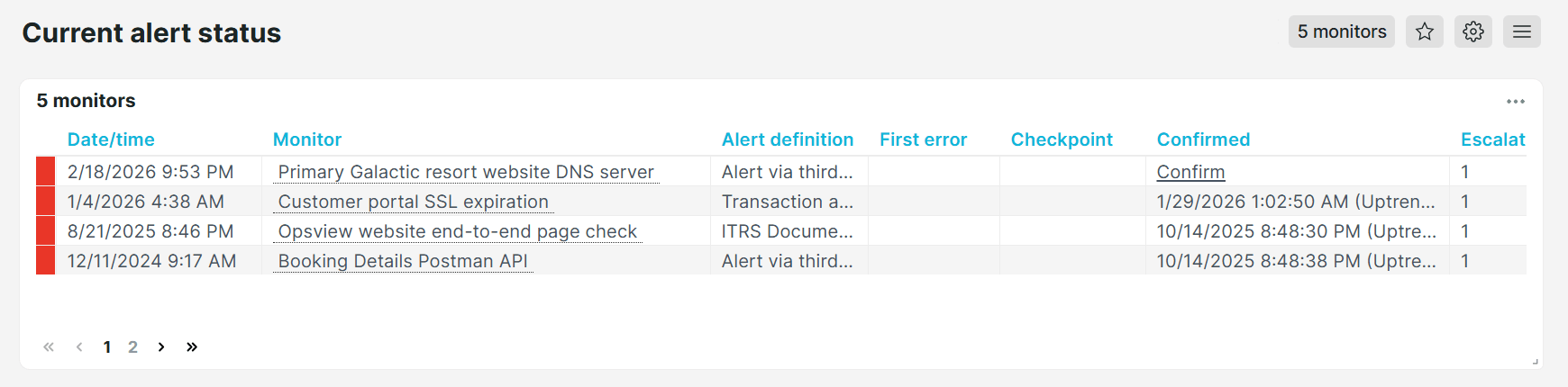
Current alert status
View all ongoing alerts across all monitors. This dashboard helps your team to quickly assess the scope of an incident. For each alert, you can see the alert definition used for notifications, the current escalation level, the checkpoint location where the issue was detected, and an option to confirm the alert directly from the dashboard for admin and tracking purposes.
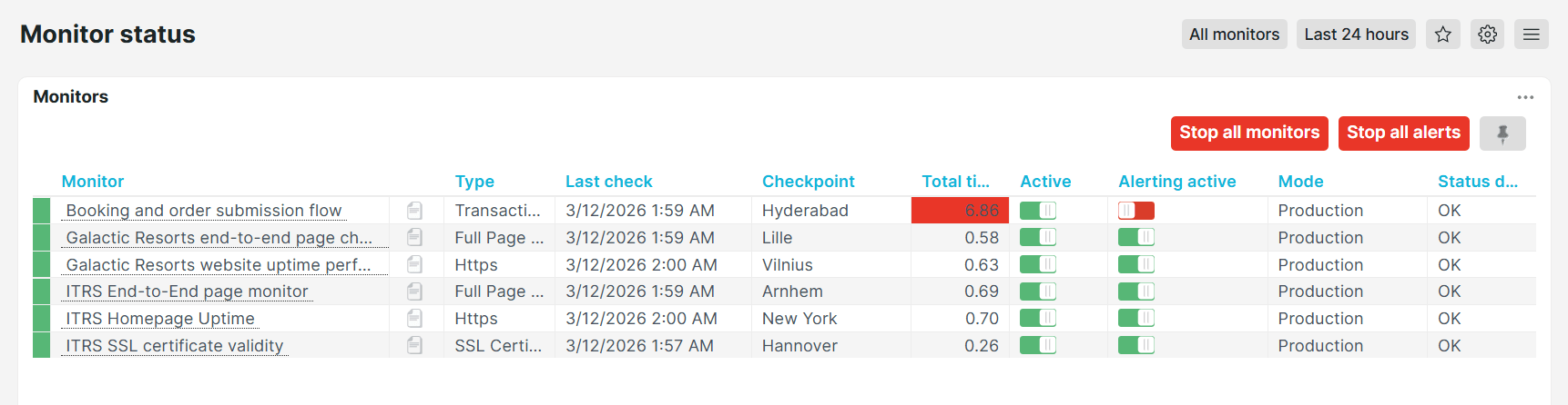
Monitor status
Check real-time status of all your monitors at a glance. This dashboard lists all monitors with their active status, type, mode, last check time, checkpoint name, total response time, and alerting status. You can disable monitors or pause alerts in bulk directly from this view, making it ideal during planned maintenance windows or rolling deployments.
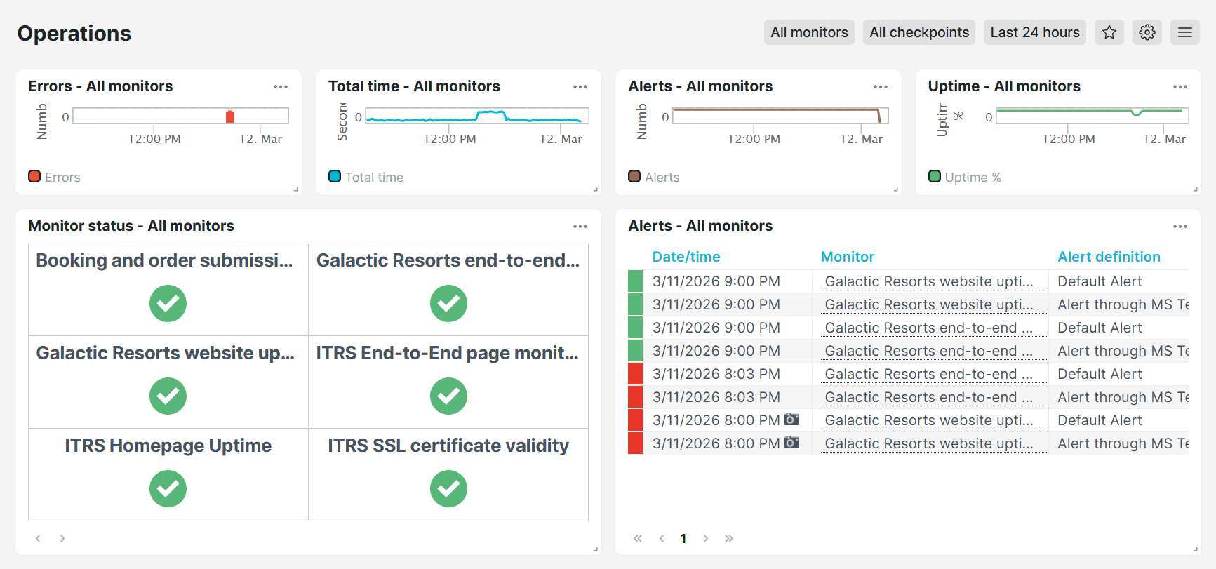
Operations
Use this dashboard to get a centralized view of your monitoring operations in one place. It combines charts for errors, total monitoring time, monitor status, and current alerts across all monitors, so your team can quickly detect and respond to issues without switching between multiple views.
Availability and errors
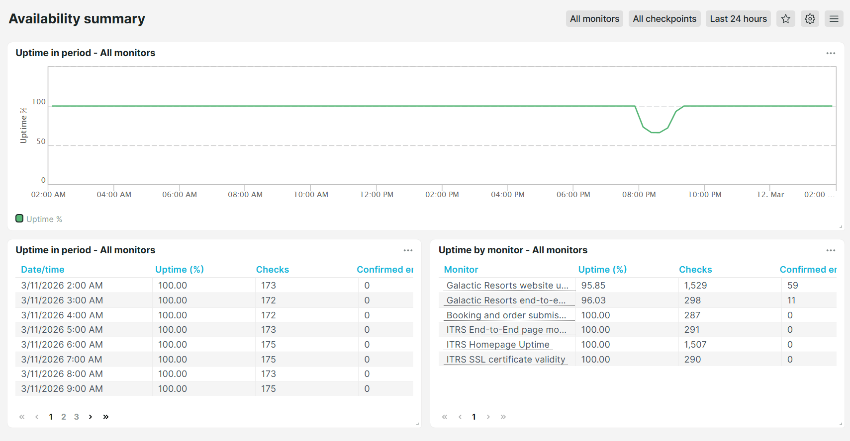
Availability summary
Use this dashboard to quickly check whether your monitors are up and running. It shows the overall uptime percentage for all monitors over a selected time period, along with the total number of checks performed and any confirmed errors.
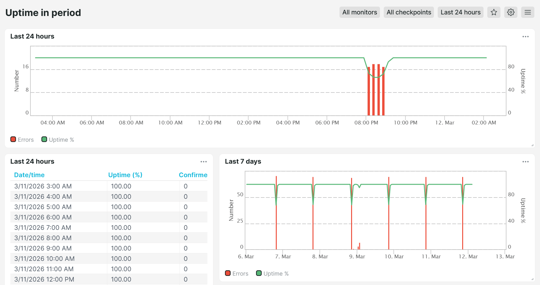
Uptime in period
Use this dashboard to review the uptime and availability of your monitors over a specific time period. It helps you investigate when downtime occurred and compare uptime performance across different time ranges.
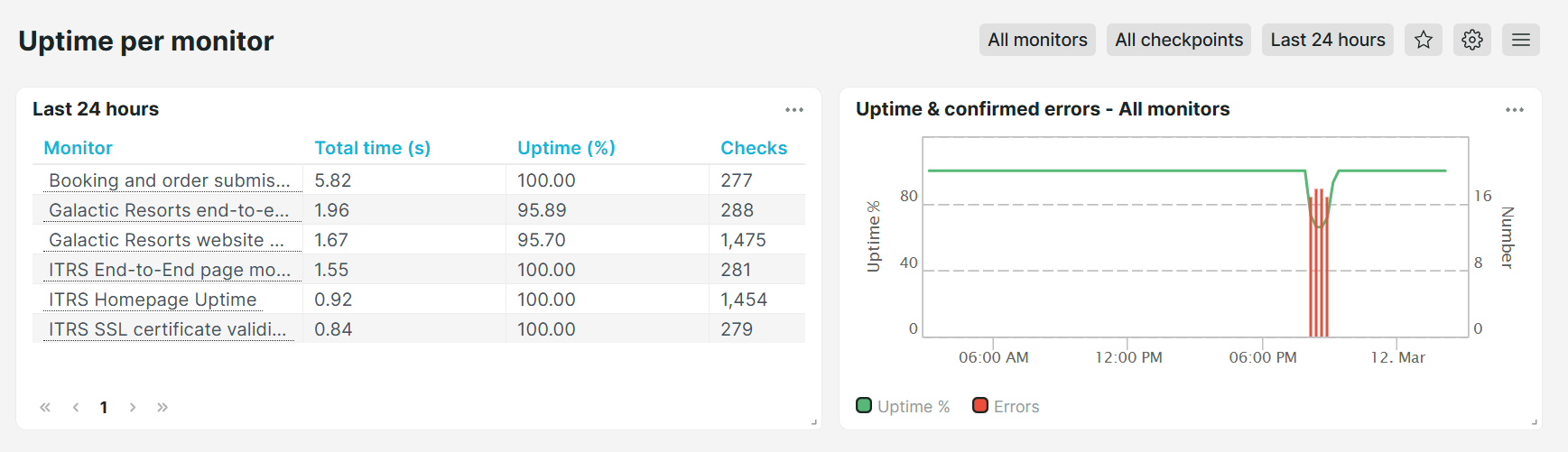
Uptime per monitor
Use this dashboard to review the uptime and availability across individual monitors. It helps you investigate which monitors need attention and compare uptime performance.
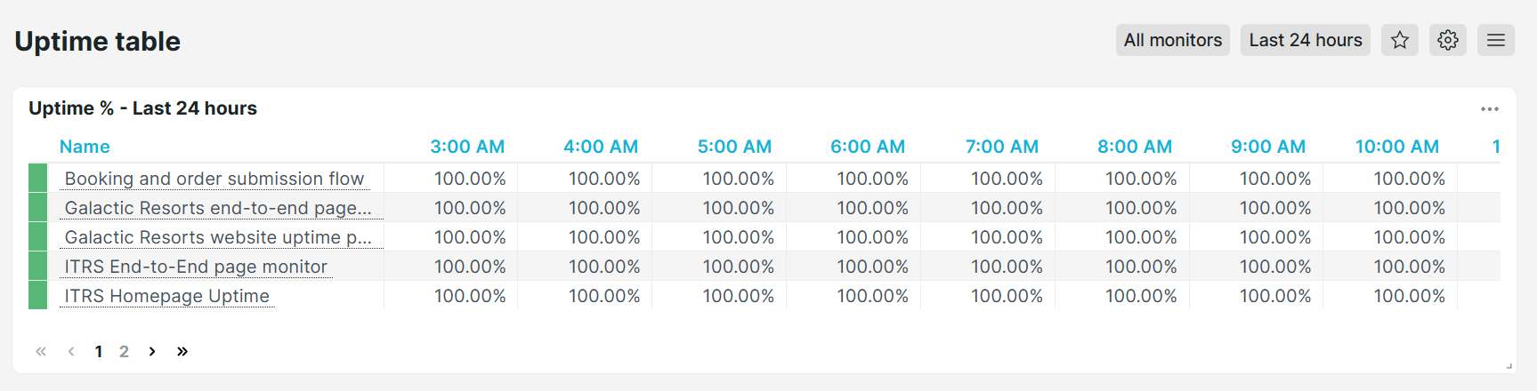
Uptime table
Shows the uptime percentages for all your monitors, giving you a quick summary of availability status.
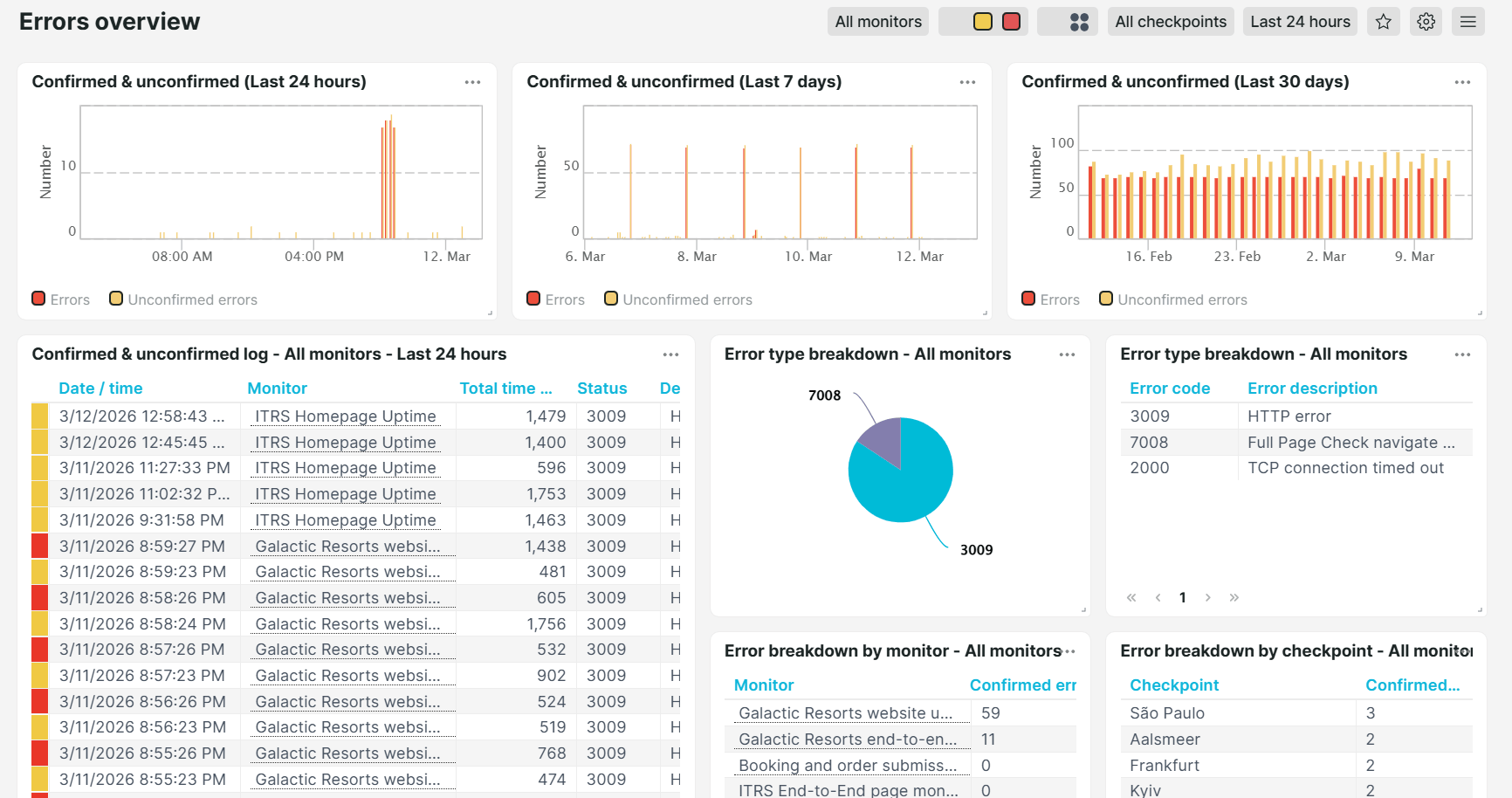
Errors overview
Provides a full view of confirmed and unconfirmed errors across all monitors for specific time periods, including last 24 hours, 7 days, 30 days, or 24 months. It also breaks down error types and descriptions per individual monitor and checkpoint location, helping you identify recurring issues and patterns.
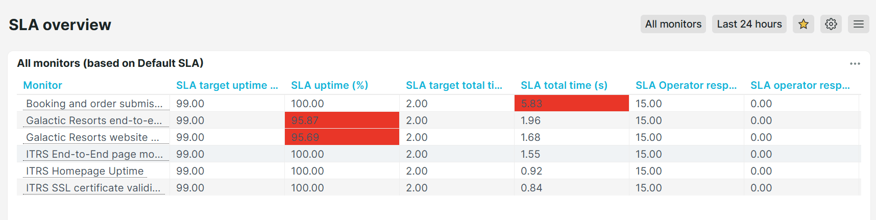
SLA overview
Displays your configured SLA targets and actual SLA results side by side, so you can immediately track whether you are meeting your Service Level Agreement (SLA) commitments and identify monitors that are at risk of breaching their targets.
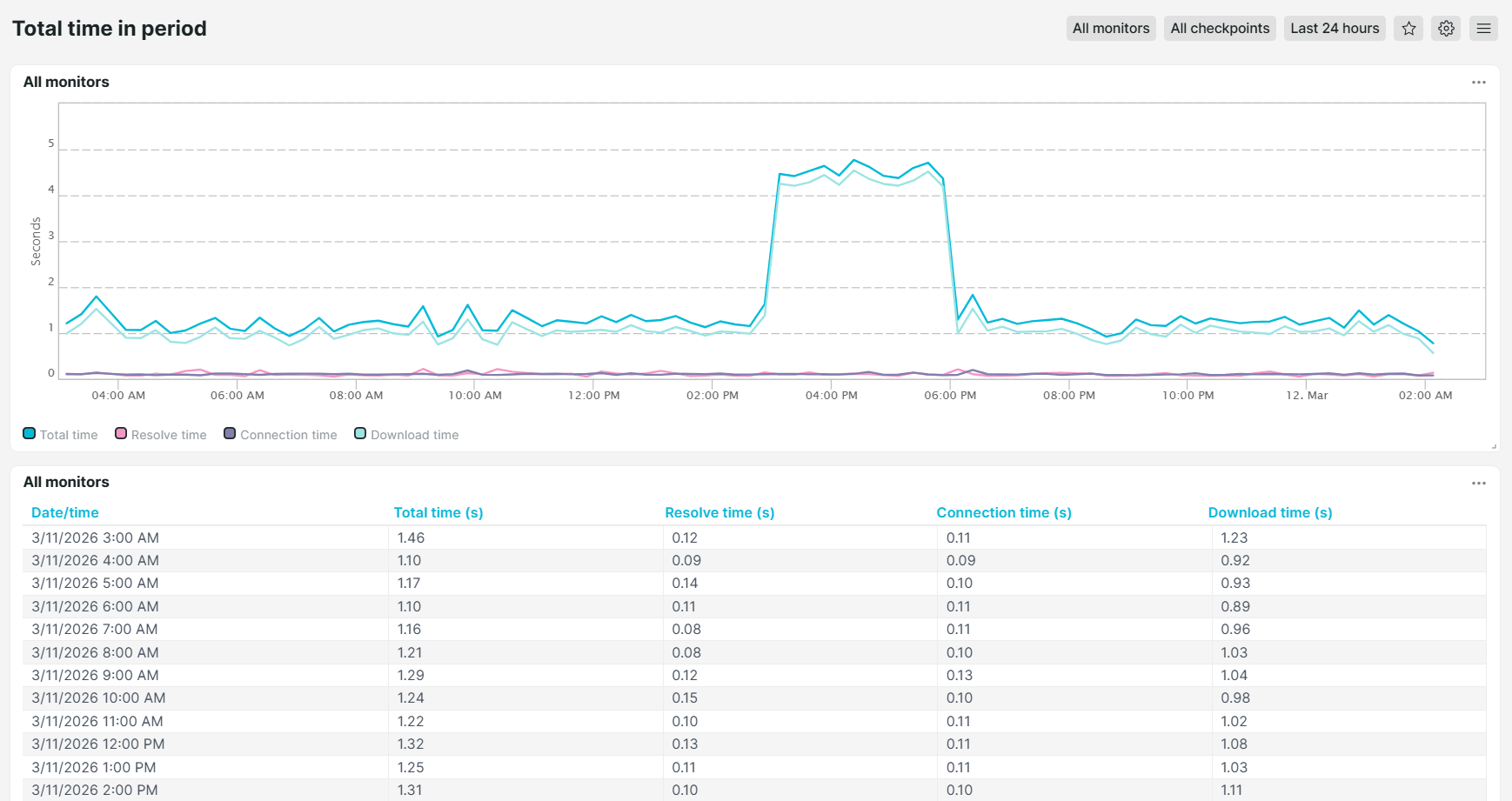
Total time in period
Shows the total load time for all monitors over a selected time period, making it easy to spot trends, sudden slowdowns, or decrease in performance.
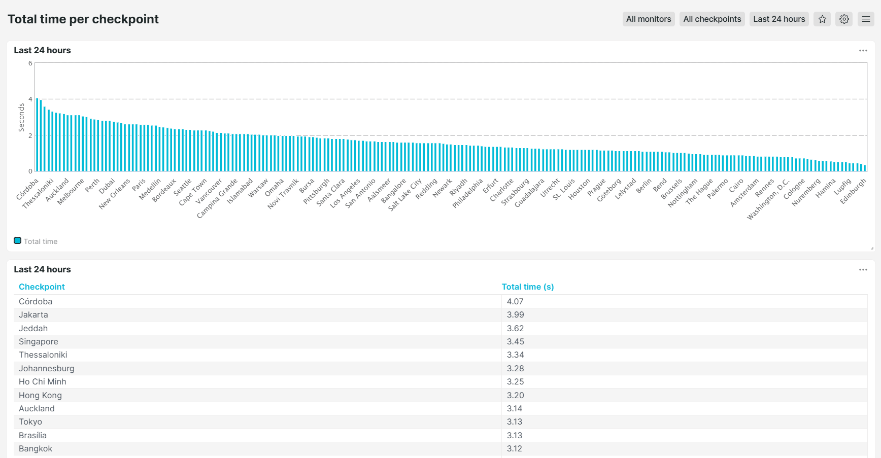
Total time per checkpoint
Shows the total load time by checkpoint location, helping you understand how your monitors perform from different geographic locations. This helps you determine whether a slowdown is isolated to a particular area or caused by other external factors.
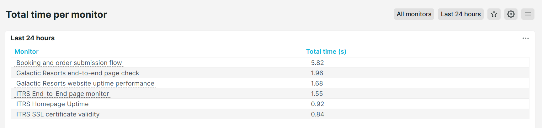
Total time per monitor
Shows total load time per individual monitor to easily identify which monitor takes the longest time to respond. This helps you prioritize performance optimization and quickly identify outliers that are impacting your users' experience.
Analysis
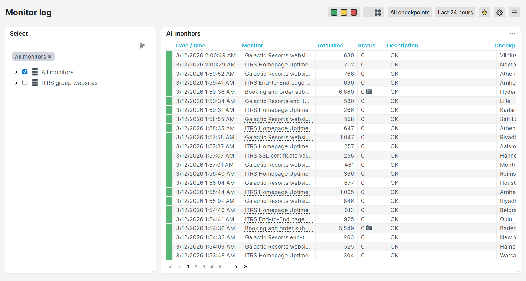
Monitor log
Provides a detailed audit log of every monitor check. Use this dashboard when investigating a specific incident. It lists each check’s date and time, total response time, status, description, and checkpoint location. Click any row to view a more detailed check result.
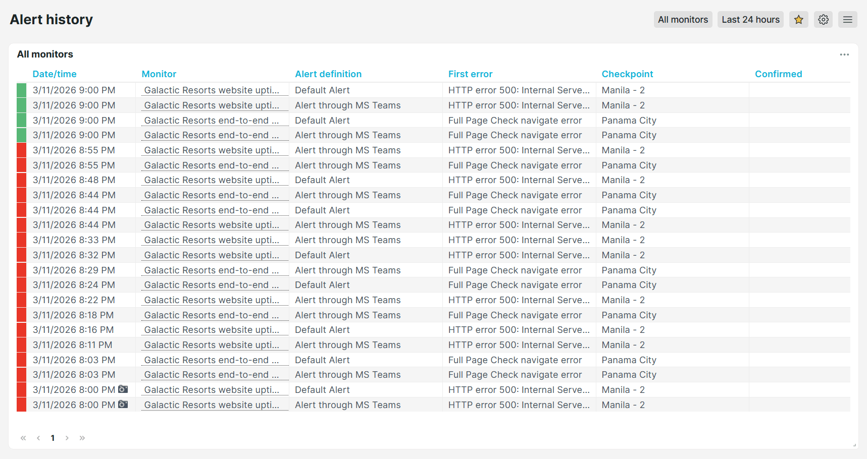
Alert history
Review alert activities across all monitors. This dashboard shows when each error was triggered, which checkpoint detected it, which alert definition fired notifications, the escalation level reached, and the description of the first error. Use it for post-incident reviews, escalation audits, or verifying that alerts are configured correctly.
Performance
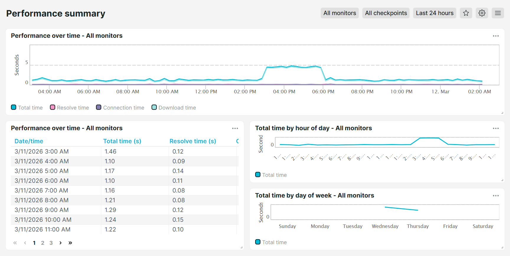
Performance summary
Shows a breakdown of your monitor’s total time based on specific periods such as by hour of day and day of week, helping you identify slow-performing monitors or those that experienced delays.
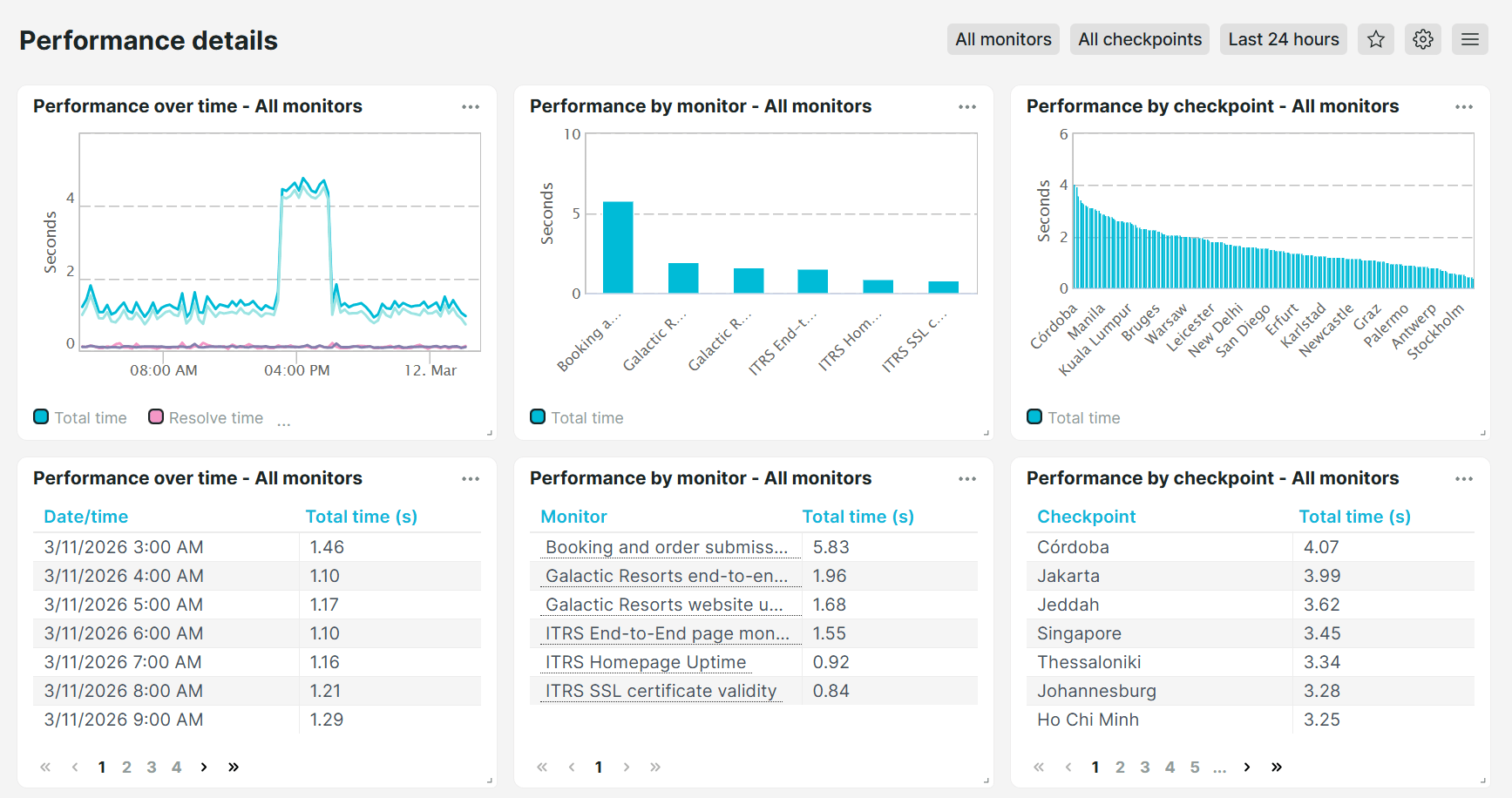
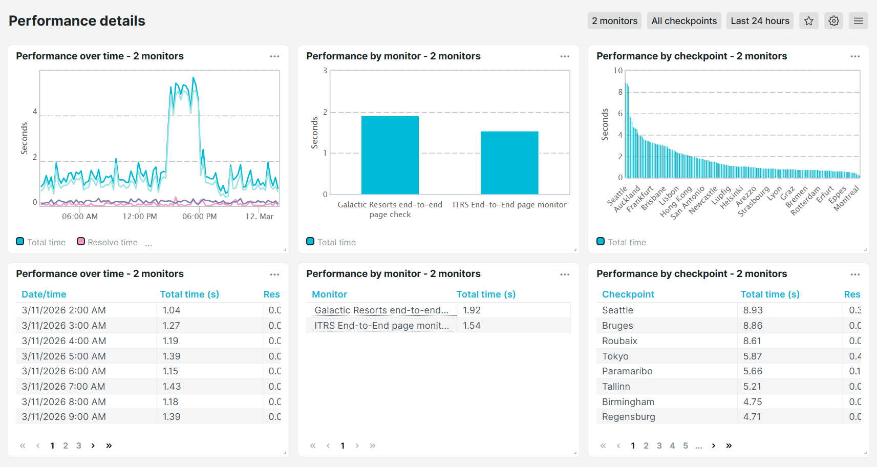
Performance details
Provides a comprehensive and deeper analysis of your monitors. This dashboard shows the total, resolve, connection, and download times in both list and graphical format, filterable by time period, individual monitor, and checkpoint location.
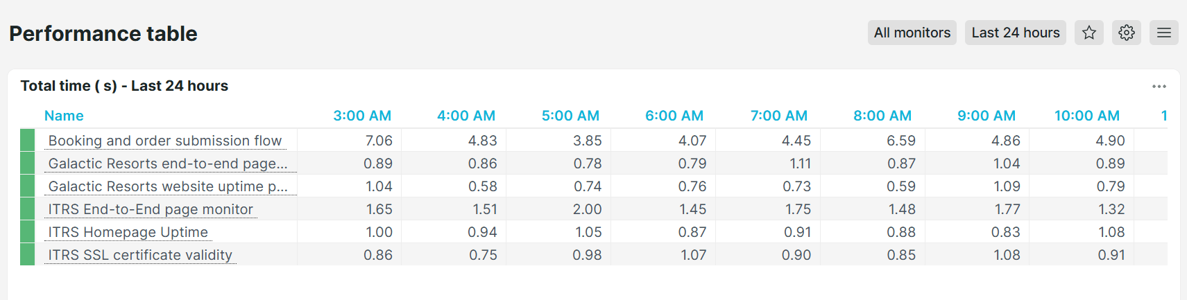
Performance table
Provides a quick overview of monitor load times and identifies slower-performing monitors.
Browser monitors performance details
Analyze the performance of your full-page check monitors in depth. This dashboard shows resolve, connection, and download times in both list and chart format, broken down by time period, individual monitor, and checkpoint location, helping you identify exactly where browser load time is being spent.
Monitor type-specific dashboards
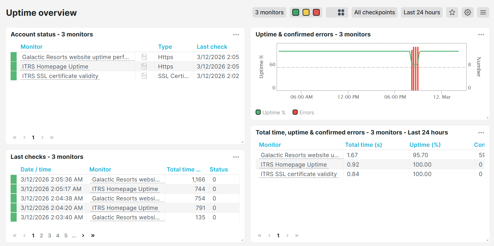
Uptime overview
Shows a consolidated view of all uptime monitors and their status, allowing you to quickly identify uptime monitors that are experiencing issues.
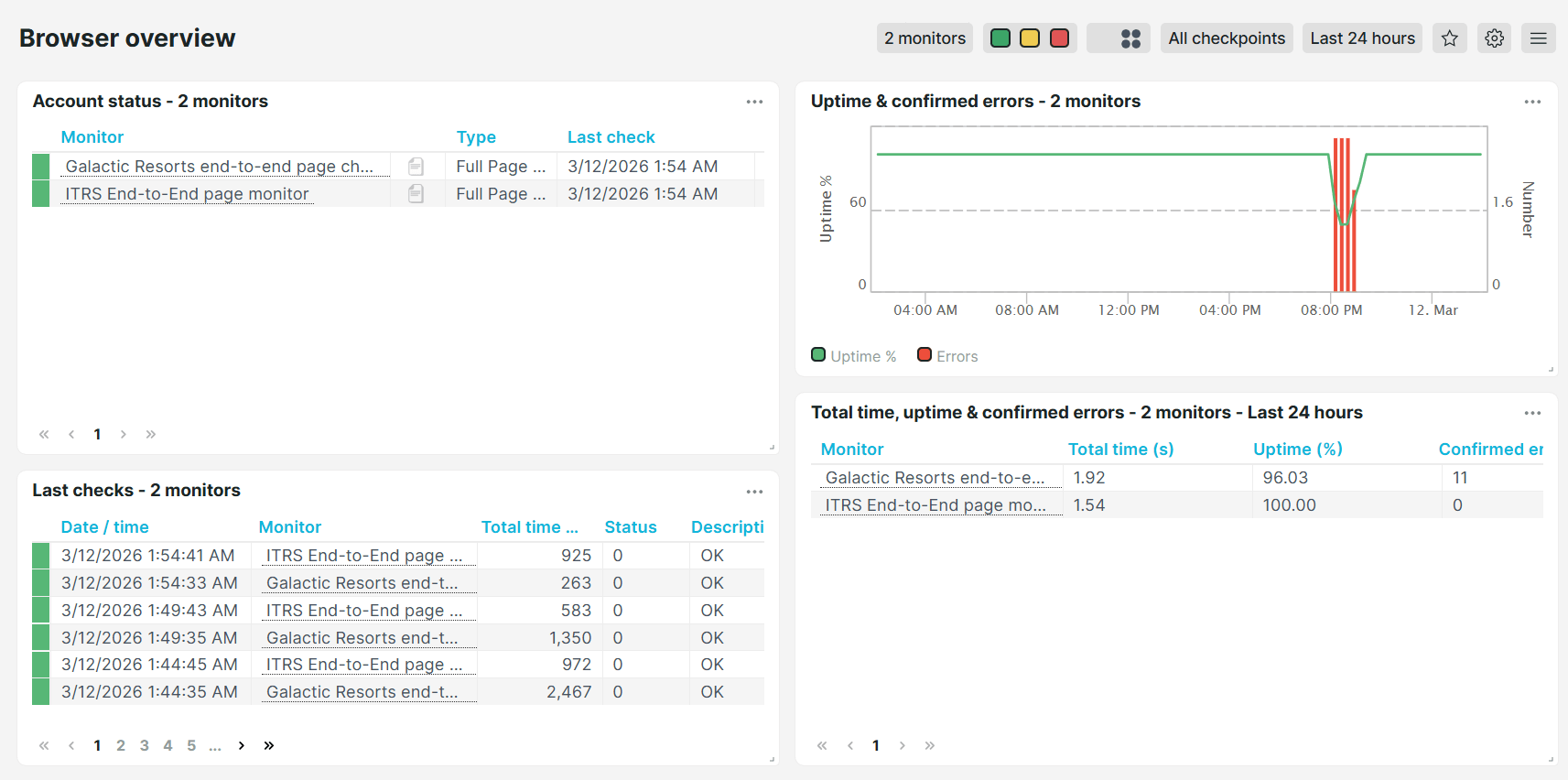
Browser overview
Shows a consolidated view of all browser (full-page check) monitors and their status, allowing you to quickly identify browser monitors that are experiencing issues.
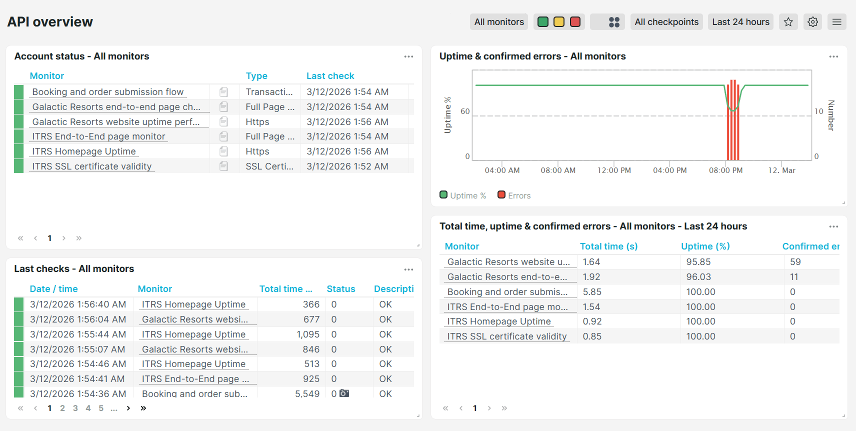
API overview
Shows a consolidated view of all API monitors and their status, allowing you to quickly identify API endpoints that are experiencing issues.
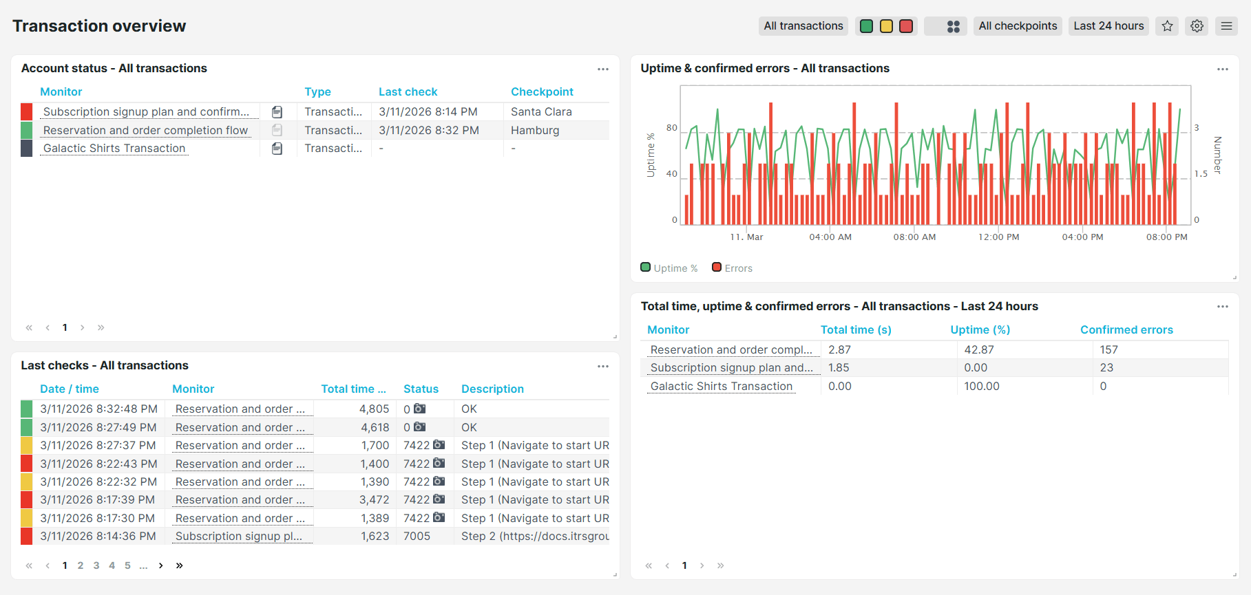
Transaction overview
Shows a consolidated view of all transaction monitors and their status, allowing you to quickly identify user flows that are experiencing issues.
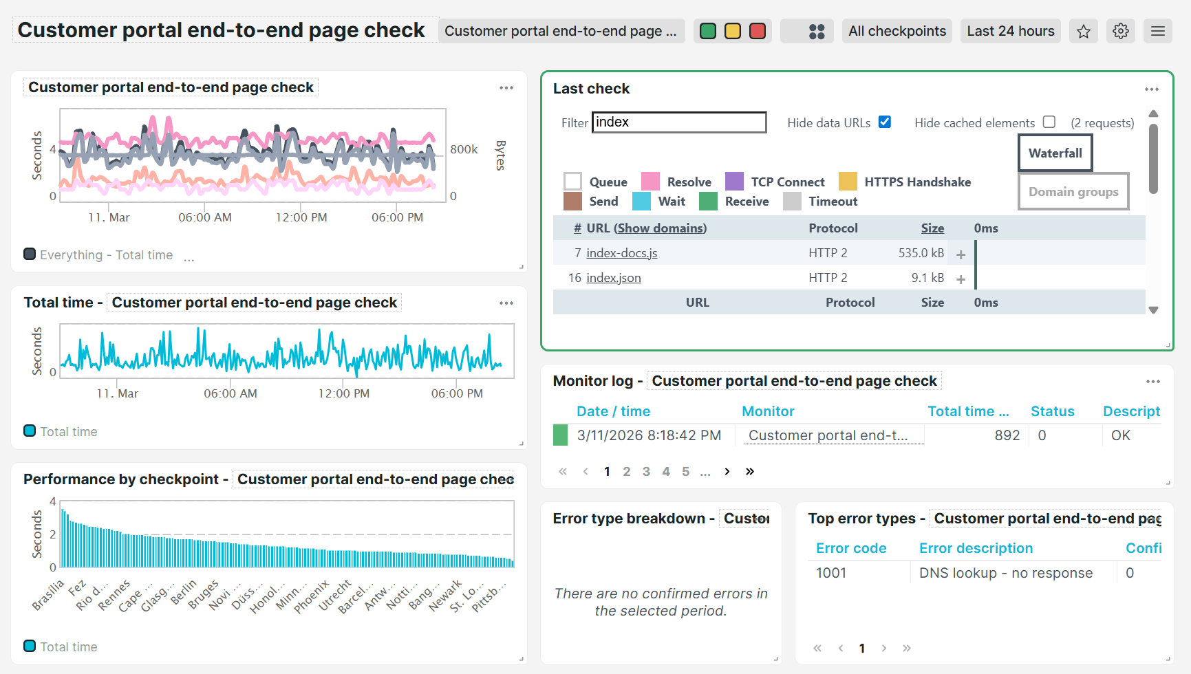
Full page check analysis
Shows a complete page analysis for your browser (enhanced full-page check) monitors. This dashboard breaks down each check into its individual timing components, including total time, error reports, waterfall, and more. This provides an extensive overview of your monitoring behavior so you can identify issues.