
Uptrends provides two pre-defined RUM dashboards to help you view and analyze your website’s performance data:
- RUM overview — displays general user information and site performance across locations, devices, and browsers.
- RUM performance — shows detailed metrics such as time to first byte, page ready time, and render duration.
These dashboards display your data in real time, updating automatically as visitors use your site. Each dashboard contains multiple tiles that show specific metrics, such as page views, load times, and user locations. You can filter the data on each dashboard or individual tile to focus on specific information. For example, you can view performance data for a particular country, device type, or browser. This helps you identify performance issues affecting specific groups of users. For more information about filtering, see RUM dashboard filters.
In addition to the pre-defined dashboards, you can create custom dashboards that display only the metrics most relevant to your needs.
RUM overview
The RUM overview dashboard shows general information about your site’s page visits and user’s experience based on their location, device, operating system, and browser type.

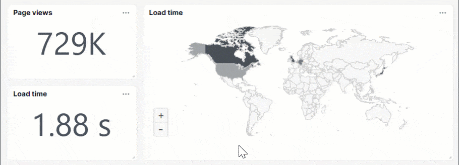
Page views
This dashboard tile shows the total number of users who visited your website. The interactive RUM world map shows a visual overview of where your page views come from, highlighting the areas of user activity.
The color intensity on the map reflects the number of page views from each country. The greener a country appears, the higher the volume of page views. This helps you easily identify your most active users in particular areas.
You can click a country on the map to see a detailed performance dashboard for that area.

Load time
This dashboard tile shows how long it takes for your site to fully load. The interactive RUM world map shows a visual overview of where your load time varies, highlighting the best and worst performing user experiences.
The color intensity on the map represents load times from each country. The darker a country appears on the map, the slower the site experience for users in that region.
You can click any country on the map to see a detailed performance dashboard for that area.
Duration
The duration dashboard tiles show you three different metrics:
- Frontend duration — number of seconds it takes for front-end resources, such as images and styles, to load and make the page viewable and interactive.
- Network duration — number of seconds it takes for the user’s browser to establish a connection with the server.
- Backend duration — number of seconds it takes for your server to process the request and return data, such as an API response.
You can click each tile to see a detailed performance dashboard for that area.

Pages
This dashboard tile shows the page URLs tracked using RUM. It also includes RUM data, such as page views, load time, and duration metrics.
Click a page from the list to view its detailed performance, or click Details to view the overall page performance.

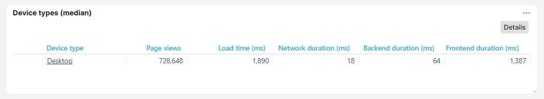
Devices
This dashboard tile displays the types of devices your users use when visiting your site, such as desktop, tablet, mobile, and others. It also includes RUM data, including page views, load time, and duration metrics.
A magnifying glass icon indicates that additional information is available. Click a device type in the list to view its detailed performance, or click Details to view overall site performance by device.
Countries
This dashboard tile lists countries where your users are located, such as United States (US) and Australia (AU). It also includes RUM data, such as page views, load time, and duration metrics.
A magnifying glass icon indicates that additional information is available. Click a country from the list to view its detailed performance, or click Details to view the overall site performance by country.

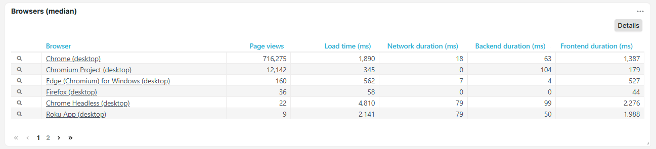
Browsers
This dashboard tile shows the browser types your users use when visiting your site, such as Chrome (desktop) and Edge (Chromium) for Windows. It also includes RUM data, such as page views, load time, and duration metrics.
A magnifying glass icon indicates that additional information is available. Click a browser type from the list to view its detailed performance, or click Details to view the overall site performance by browser type.
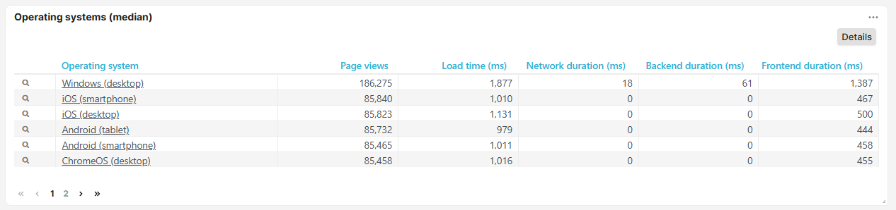
Operating systems
This dashboard tile shows the operating systems users have when visiting your website, such as Windows (desktop), iOS (smartphone), and iOS (desktop). It also includes RUM data, such as page views, load time, and duration metrics.
A magnifying glass icon indicates that additional information is available. Click an operating system from the list to view its detailed performance, or click Details to view the overall site performance by operating system.
RUM performance dashboard
The RUM performance dashboard contains detailed performance metrics, such as time to first byte, render, and DOM duration. Information is displayed about load times, network durations, backend durations, frontend durations, and total download time. The performance dashboard displays the data in convenient tables and graphs.

Metrics
The RUM performance dashboard shows the following metrics:
- Load time — the time it takes for your site to initially display resources. You can see the page, but some background scripts may still be running.
- Time to first byte (ms) — time, in milliseconds, it takes for the browser to start receiving a response after opening the website. Lower TTFB indicates better site performance.
- Page ready time (ms) — total time, in milliseconds, for the page to fully load and become interactive. Lower page ready times indicate better site performance.
- Network — total time for the user’s browser and web server to establish a network connection.
- Redirect duration (ms) — total time, in milliseconds, for the browser to visit a different URL before loading the target page. Longer redirect durations slow down access to the requested page.
- DNS duration (ms) — total time, in milliseconds, to resolve a domain name (example.com) into its corresponding IP address before establishing a connection. Longer DNS durations delay the start of page load.
- Connect duration (ms) — total time, in milliseconds, to establish a TCP connection between the user’s browser and web server after DNS resolution. Longer connect durations may indicate network congestion or high latency.
- Backend — total time spent on server-side processing to handle the request and generate a response.
- Send duration (ms) — time, in milliseconds, for the browser to send the HTTP request to the server. Longer send durations may indicate network issues or large request payloads.
- Receive duration (ms) — time, in milliseconds, for the browser to download response data after receiving the first byte. Longer receive durations may indicate network issues, large file sizes, or slow server response times.
- Frontend — total time spent rendering and displaying webpage content in the user’s browser after receiving data from the server.
- DOM duration (ms) — time, in milliseconds, for the browser to parse HTML and build the Document Object Model (DOM). Longer DOM durations may indicate complex structures or blocking scripts.
- Render duration (ms) — time, in milliseconds, for the browser to apply styles, load images, and execute scripts to visually render the page. Longer render durations may indicate complex layouts or heavy resources.
- Download time (ms) — time, in milliseconds, to fetch all front-end resources, such as images, CSS files, and scripts. Longer download times may indicate large resources or a slow network connection.