Every time you monitor your websites, servers, and other web services, the monitor generates results that are the key metrics to help you evaluate their availability and performance. This article explains how to visualize and export this monitoring data, so you can analyze and gain valuable insights through the use of dashboards and reports.
Dashboards
Dashboards allow you to visualize your monitoring information using charts and tables, all in one place. Uptrends provides ready-made dashboards called Pre-defined dashboards, showing the overall performance, reliability, and operations of your monitors.
You’ll find dashboards for each monitor type that display the overall status of your monitors. For example, the Uptime overview displays data for all your uptime monitors. There’s also a dedicated dashboard for each monitor. Additionally, there are specific pre-defined dashboards like the SLA overview that shows statistics for SLAs (Service level agreements), as well as other dashboards tailored to the specific insights you need.
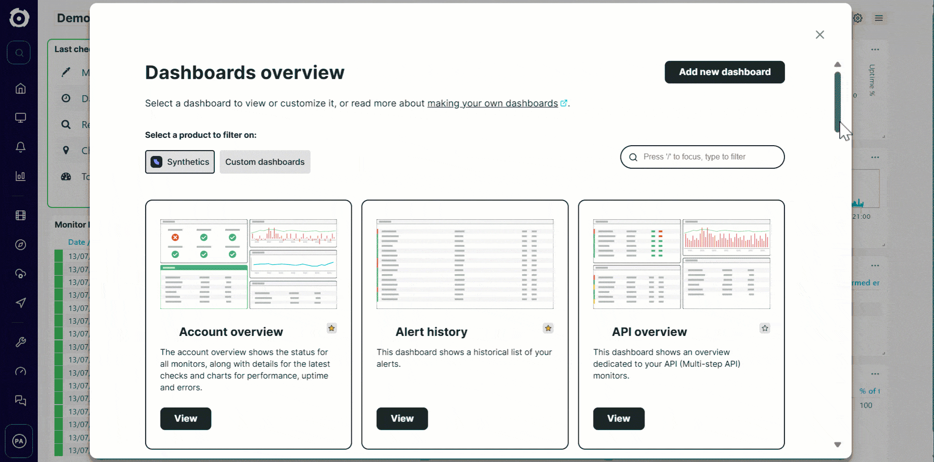
Aside from the pre-defined dashboards, you can also customize or build your own from scratch using Custom dashboards. You can set up custom report tiles to show your monitor metrics in a tabular or graph format and filter the data that you see. To know more information, refer to the Dashboards overview article.
Reporting
All dashboard data can be exported into PDF and Excel (.xls) format. You can also schedule these exported reports to be automatically sent to specified recipients through email.
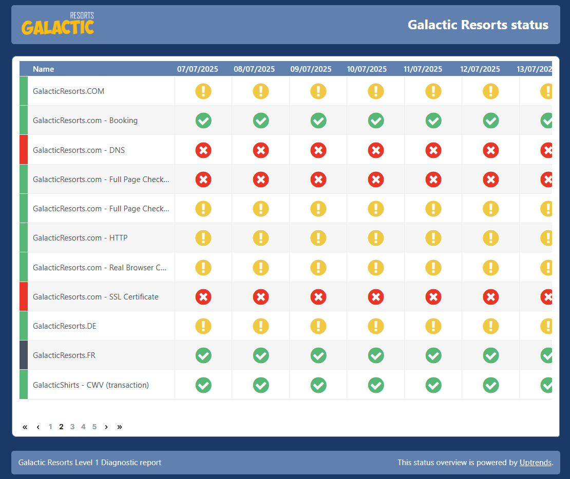
If you want to share your data externally and outside your Uptrends account, Uptrends offers Public and protected status pages to make your monitoring information available to the general public or specific audiences. Here is an example of a public status page that tracks the performance of the Galactic Resorts Destinations,which is a fictional website for holiday space destinations.